MUSIC 256A
Mollie Redman
“Design should understand us”. This feels so profound and makes me want to snap my fingers, however, thinking deeper about this statement makes me feel like I am saying the Earth is the center of our ecosystem.
I do not think it is necessarily a bad thing to put humans at the center of our models, oftentimes it is needed! What I am saying is, does design consider the rest of our world?
Does it think about the plants, animals, and molecules which make up our environment?
Are we even capable of designing things for non-human life or a non-living thing?
I’m unsure how you would even be able to validate a design in this case, but I do think it is a question worth asking.
“Design is poetry”. Finger snaps!!! This statement speaks to me in a way that feels like a fundamental truth.
Since I admire this statement so much, I wanted to break it down to get a better sense for the complexity of it. I looked at these two equations:
Design = Poetry, therefore
Poetry = Pragmatics X Aesthetics OR Function X Form OR Engineering X Pure Art
Looking at these two equations, I thought to myself, can poetry be made up of anything other than poetry? So I did some testing and broke it into separate parts.
Poetry = Aesthetics → hmm I am not sure I would agree with this, let’s make a change
Poetry = Pure Art → when swapping out the term aesthetics with pure art, I would agree! Yes, indeed, Pure Art is poetry. Why else would we (I) stare at paintings in museums until my feet hurt.
Moving on to the other side of the equation:
Poetry = Pragmatics → Definitely not poetry
Poetry = Function → This isn’t poetry either
Ok last try…
Poetry = Engineering → Hmm let’s sit on this
Is Engineering poetry? From a practical and functional perspective, we (I) said no.
But for some reason, the word engineering sorta hits. Thinking more deeply, I think this comes back to the thought that design isn’t necessarily human-centered.
Engineering is a field that aims to better understand the world around us. It discovers mathematical theories that govern the space around us.
That is a beautiful thing that is poetry worthy.
We are definitely limited in our understanding of the world, and have much more to learn from a scientific perspective, however, the same is true for our understanding of humans.
In the never-ending pursuit of knowledge, we will forever have gaps that must be lived with during our lifetime, and design is a tool that helps us live with the unexplainable in our world.

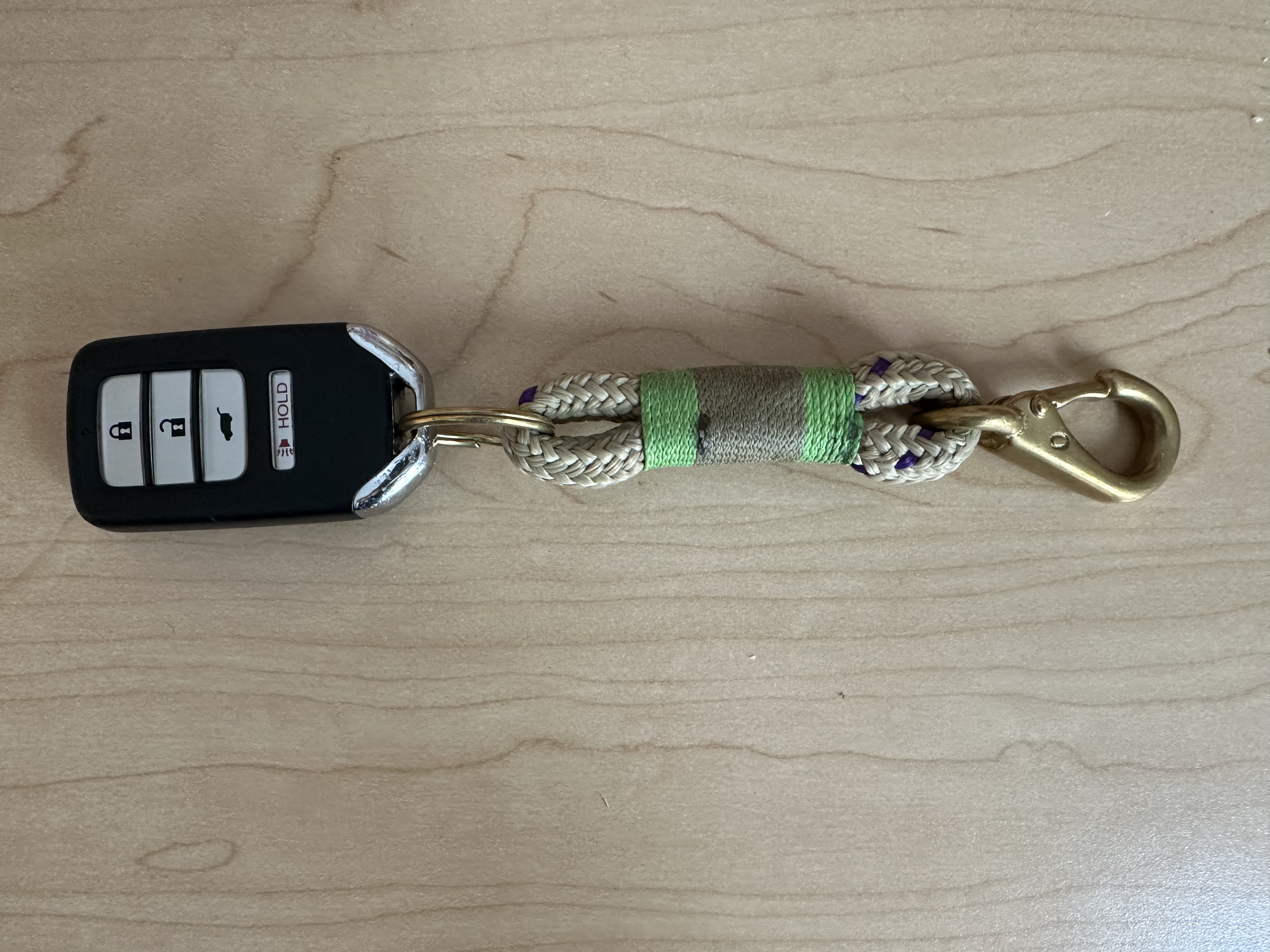
| Object: | Keychain |
|---|---|
| Means to the end | End in itself |
| Holds keys together | --> But if it only holds 1 key, is it a means to an end? |
| Brightly colored to keep it from getting lost | --> The colors make me feel happy. Purple is one of my favorite colors and I really enjoy the small specks of purple in the brown part of the rope. |
| Clip to hook onto objects | --> To be honest, the hook isn't all that functional. It is a bit loose, making it more decorative. Additionally, the gold is a flashy choice. |
| Materials are durable for long-lasting usage | --> I bought the keychain at my favorite beach town in Maine. The materiality of it evokes a sense of home for me and by holding it, I feel grounded. |


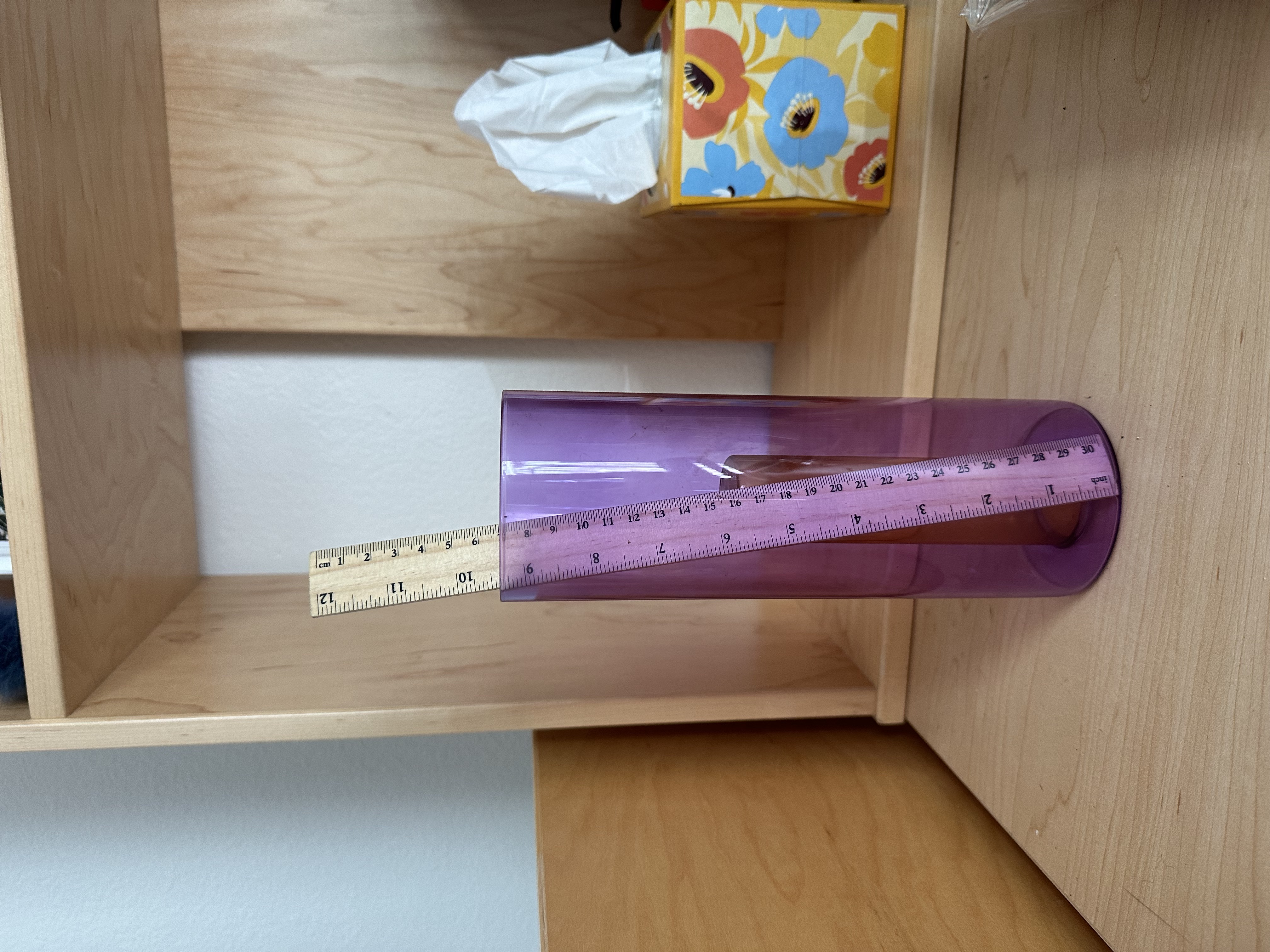
| Object: | Flower vase |
|---|---|
| Means to the end | End in itself |
| Can hold 1 flower, Can hold many flowers | --> I don't think that displaying flowers has any real purpose // or at least not in my life. I do it because it brings me joy, not because it is practical for me to buy them at Trader Joe's. |
| Vase is dual purpose | --> It elegantly transitions between its two functional modes (one v many flowers) |
| Container is sealed so that no water leaks out | --> The vase is translucent which highlights the elegance of the solution --> Glass is not the most practical material since it is delicate and can break, however, it speaks to the similar fragility of life that flowers embody, making it an artful choice |
| I quite like the colors (as mentioned earlier, purple is one of my favorites). This vase did not NEED to be colored, it could have easily been clear. However, I think that the contrast between the yellow and purple does a nice job highlighting its different elements. |

| Object: | Pants button |
|---|---|
| Means to the end | End in itself |
| Long lasting material which is durable and will not fail during the life of the garment (hopefully) | --> the undulating texture looks like liquid in motion and is unlike any other button I have seen before --> The metal is finished with texture that sheens, not shines. I like that because shiny objects that blind me (i.e., cars, phones, mirrors) are annoying |
| Keeps pants buttoned |


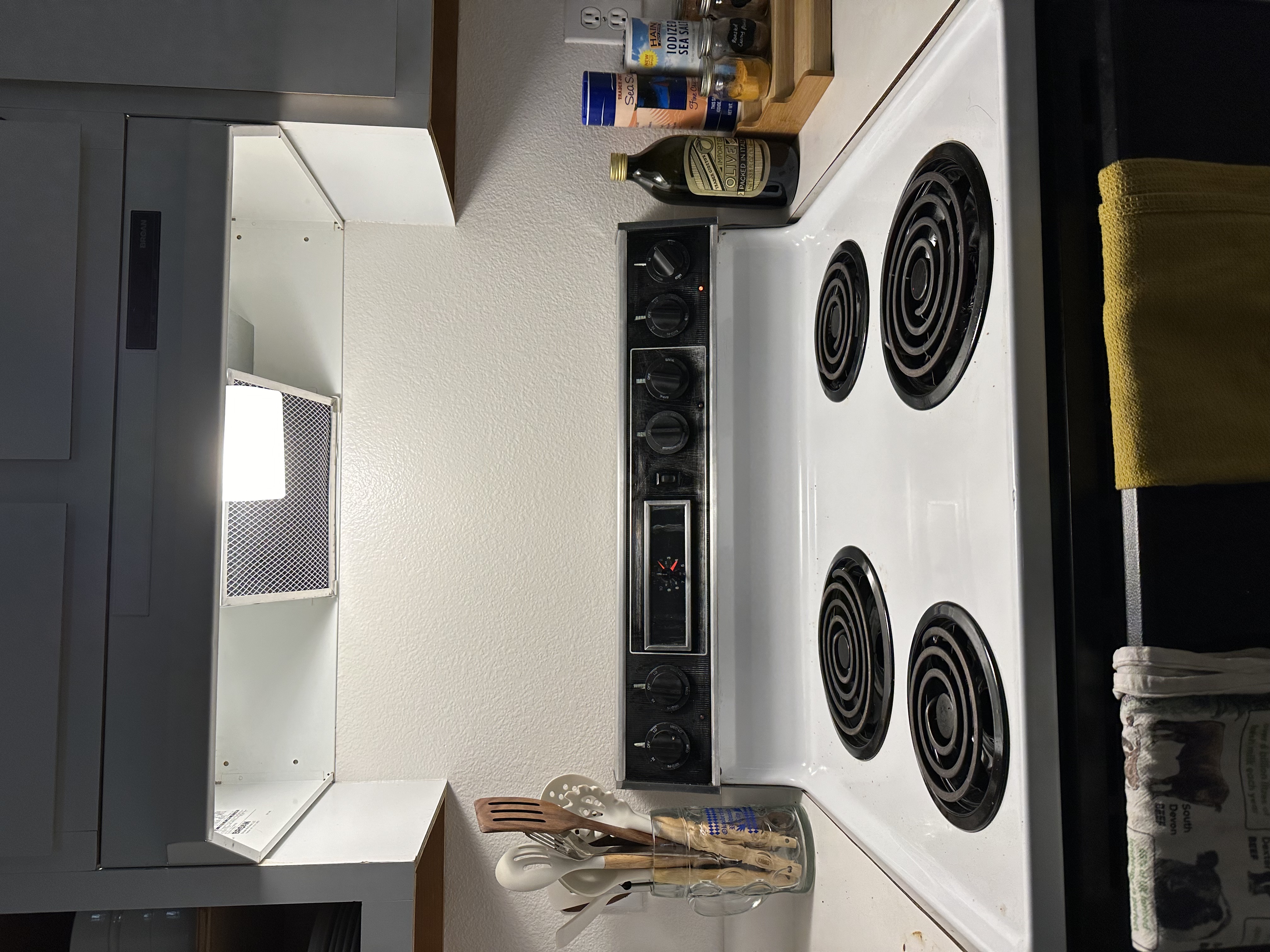
When my mom set eyes on my stove in Rains, she exclaimed, "This looks exactly like the stove we had in the 80s." Not in a 'woah cool, that looks retro' way, but in a 'that looks old, and is old' kind of way. To me the most shocking part was that after all these years, there were a few crappy stickers hanging on above each knob. Maybe at one point they indicated which stovetop they controlled, but at this point they were pretty worn away and any information on them was no longer visible. In an effort to inject aesthetics into my life I decided I should make an aesthetic sticker to put on the stove. I made a quick sketch in figma, then cut them out on the cricut vinyl cutter. I chose to use bright yellow to highlight because 1. it is a cheerful color and 2. it would match our yello tea towel. I am really happy with how it turned out and now every time I look at the stove, I am excited to look at my stickers!

