Music 256A, Stanford University
Reading Response Chapter 1: "Design Is ______"
Homework 1 - Music 256A, 09/27/2019
Jan Stoltenberg
Stanford University
Reading response
IF YOU WISH TO GO TO THE VISUALIZER/SOUNDPEEK HOMEWORK, PLEASE CLICK HERE!
Artful Design’s chapter one was quite inspiring and raised many different thoughts while reading it. I
believe that many readers have a specific past/present or even future project in mind that they are thinking
about when reading the book. While it’s great to think about the content in general terms, I personally
found it even more challenging when comparing it to a present project that I’m working on. While trying to
relate the tips and ideas to my current project while reading, new questions were constantly arising and the
whole thing seemed much more complicated when considering my specific scenario. This most probably happens
due to the fact that many personal factors and different complications are involved in the way of designing
something as soon as it gets a little more concrete.
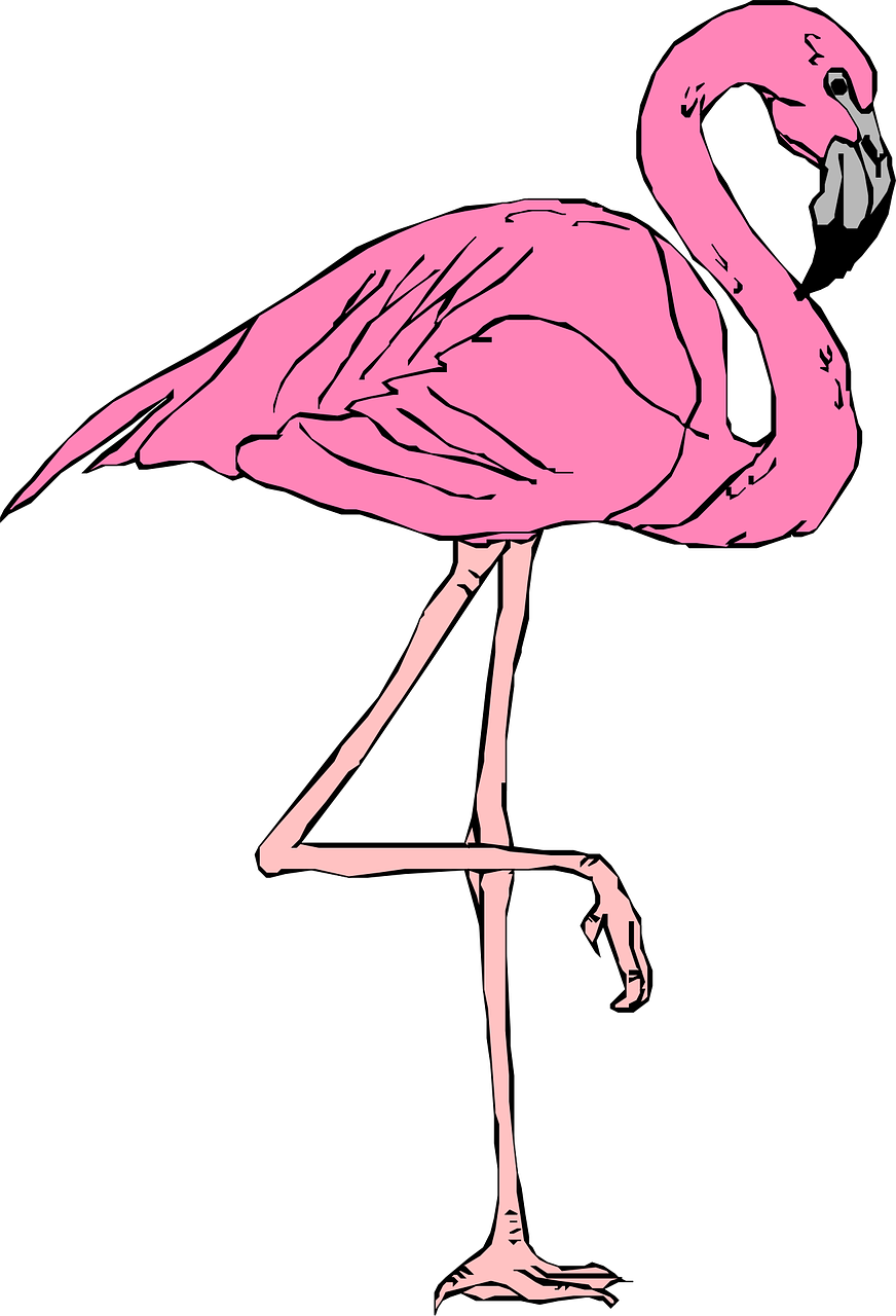
To quickly describe my project before arguing about the passage above: I will create a Youtube channel that
contains spatially mixed binaural music and am currently thinking about adding a flamingo animation to the
logo. The flamingo doesn’t have any particular connection with the content, nor the logo. It is an animal
that I (in all subjectiveness) like and that I link with joy and style: It’s elegant, knows how to stand one
leg and has a beautiful pink color. It’s also quite mythical, because flamingos are shy and don’t usually
come close to humans.
I believe this flamingo could add a certain amount of personality to the channel.
In a similar way, the eyes of the pencil case make it a monster but don’t add any functional value. These
eyes rather create a personality/character, making it more alive.
A different, related example would be Apple’s apple logo. It’s not related to the product itself, they sell
computers, not fruits. But it does imply simplicity in its design. Also, apple might intentionally have
chosen an object for its logo instead of a character, because they sell a machine that is supposed to
help/extend human being with an existing personality instead of creating a new one.
My second thought (other than a created personality of an item) is related to the symbioses of function and
the look.
One could argue that the monster is a little more related to its original function, as monsters are known
for eating a lot and it ‘eats’ the pencils as soon as they’re put into the case. While the flamingo doesn’t
interact with anything, I personally project the flamingo’s personality traits onto the channel
automatically. In that sense that a lion would make the channel appear a bit wilder and explorative,
the flamingo might underline the elegance and simplicity of the presented audio technology. It radiates
peace and calmness, which helps to enjoy music. Also, it’s playful!
Question to Ge: When you drew the small penguins on page 43, what was your intent? I like them because
they make the whole drawing more alive. A simple Iceberg might be sublime, yes, but the penguins make
the picture quite relatable, cute and alive. Because penguins are alive, just like flamingos are. And
humans are social beings by nature!
Taking notice
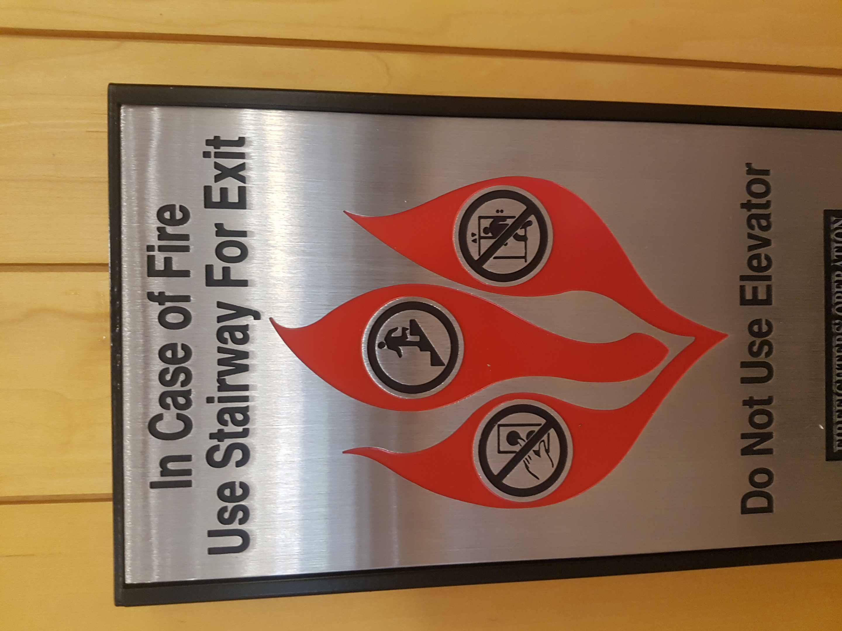
This sign is quite interesting, mainly because signs on elevators are not known for looking fancy in any way. The three curvy flames are particularly artsy and non-symmetric. Note that each flame includes a different smaller sign. On second glance though, all the three signs show the same message: Don't use the elevator but the stairs, while the middle flame shows what to do and the outer flames show what not to do. The whole point of this is that this sign contains important information for a very dramatic scenario, but it's still expressed in a quite artful way. Still, even in the rush of adrenaline, the flames and it's content are most-likely identifiable.
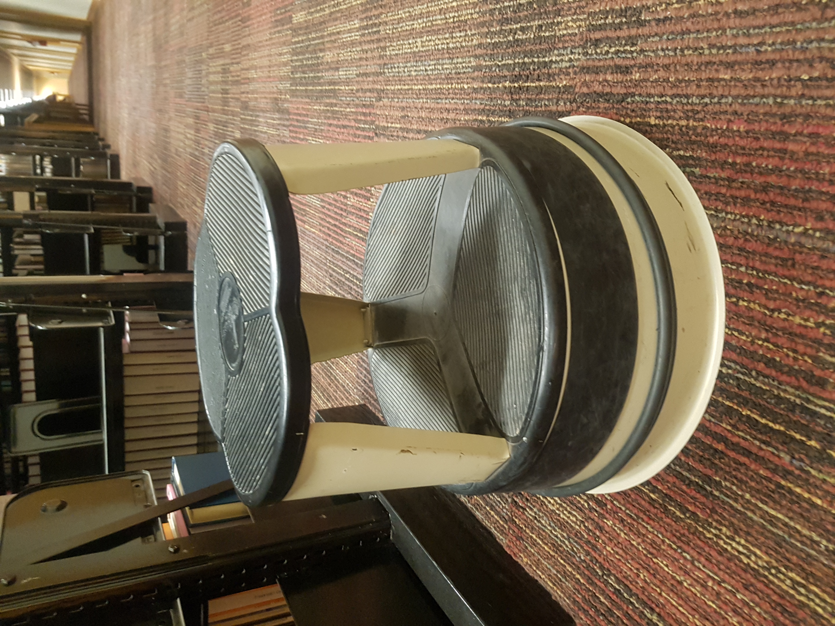
This stool, found in Stanford's Green Library, has an interesting design to it. Concerning the function, this
object affords to stand on it on two different height levels.
Most probably, the lower surface is just supportive to help one get onto the higher level.
The object looks interesting and non-generic, plus quite stable and solid. A great combination of a playful,
round design that expresses an extended functionality at the same time.

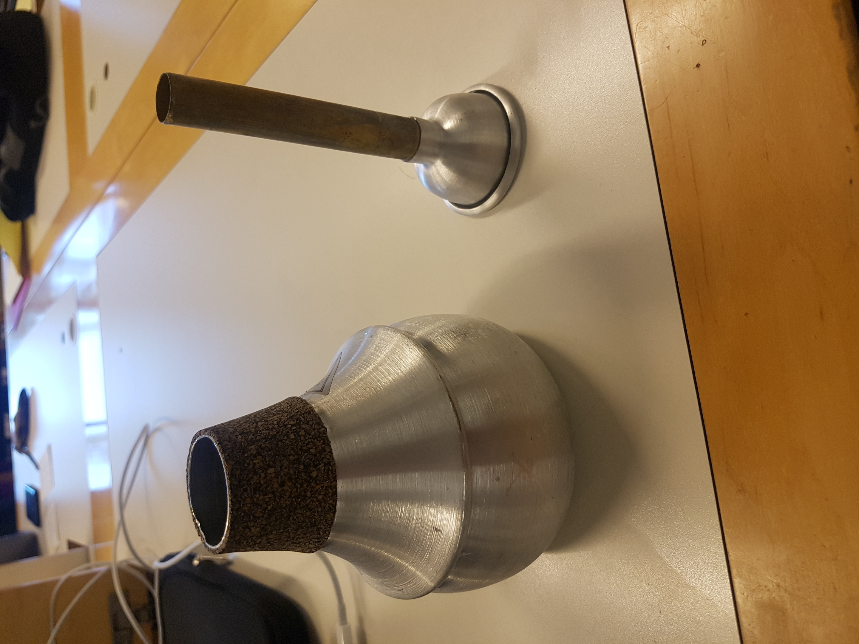
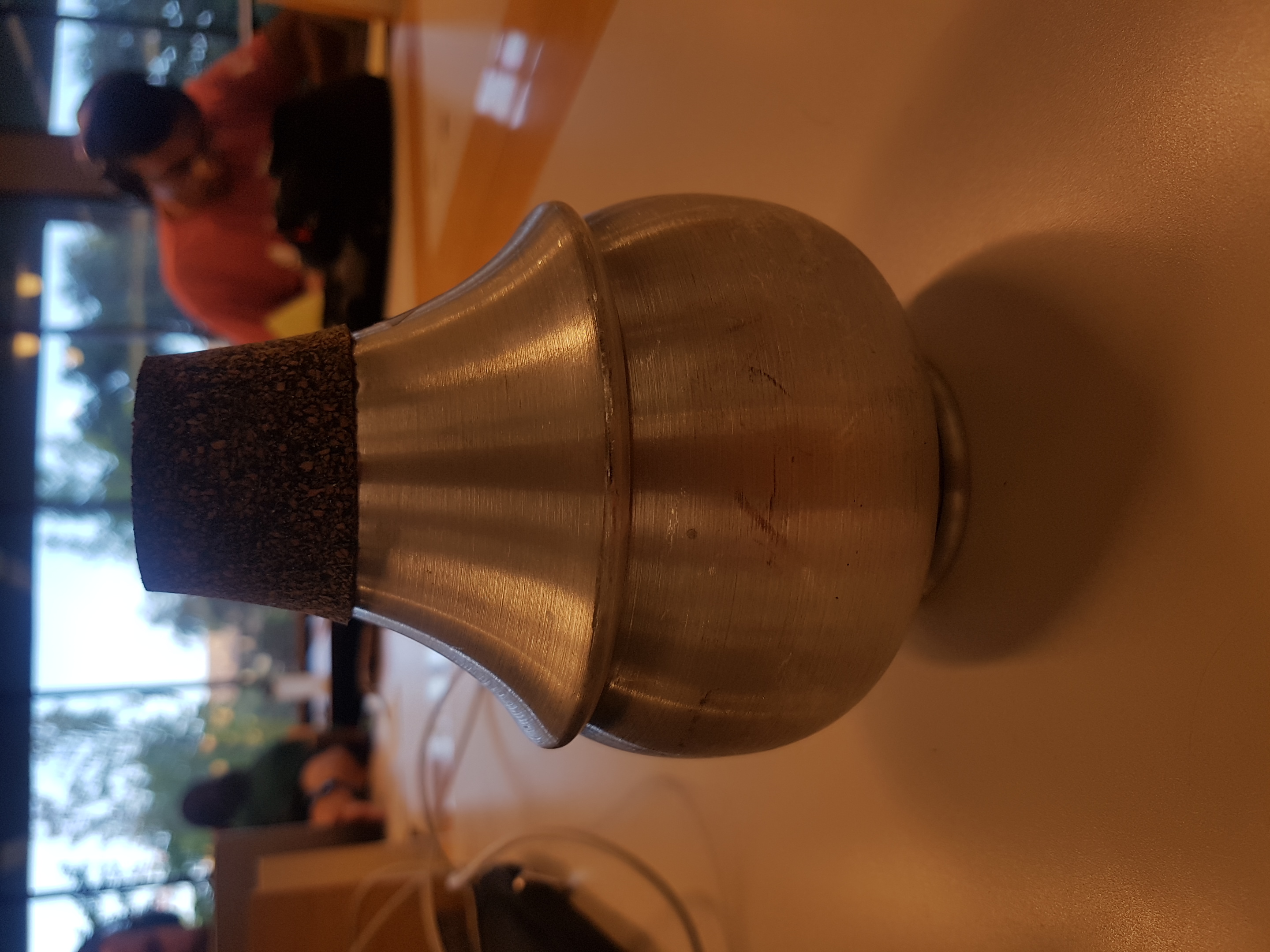
One of my favourite toys: The Jo Ral trumpet mute's matt silver material is not only shiny and well-formed visually, but obviously serves a bigger context than it's visual appearance: It's a great-sounding, very characteristic form and material for a smooth jazz sound for trumpeters! The little aluminium thingy, which looks similar to a mouth-piece, is a little add-on that one can stick into the bigger component to create an additional spectral change. The way this damper looks, feels and sounds might be the best example of function and design, even though the visual aspect might not have been that much considered during the creation. Does art follow function (sound art) here?
ChucK excercise
Click on the image to check out the code:

Guerrilla Design
Brief anectode: A friend of mine dropped her phone, which created these spiderweb-like patterns on the back that nobody likes. However, she put some nail polish onto these cracks in the glass and made it look cool and artful. Since the phone was a little dated, we decided to (carefully) punch in a few mode little cracks with a tiny hammer until the whole back was cracked without falling apart. After painting it with the nail polish, we had created a really unique look from what originally looked like a very used phone.